
Evexia Supplements
THE GOAL
Evexia was looking for a timeless, sophisticated brand that would stand out against a highly saturated market of busy- looking supplements. The goal was to create an impactful visual language with strategic, clear brand guidelines, positioning Evexia as a trusted lifestyle supplement for young professional men.
THE OUTCOME
The project delivered a sleek logo, nature-inspired color palette, cohesive photo direction, and consistent typography reflecting Evexia’s values and strategic positioning. I created comprehensive brand guidelines to ensure clarity and consistency, helping Evexia confidently establish itself in the supplement market.


The Project
From social media and packaging to web and photography, every touchpoint was designed to feel intentional and aligned with Evexia’s science-backed, natural ethos. I dove deep into strategy by analyzing competitors, studying lifestyle habits, and researching favorite fashion and wellness brands to understand what truly resonates. That insight shaped a brand identity that stands out visually and connects meaningfully with its audience.
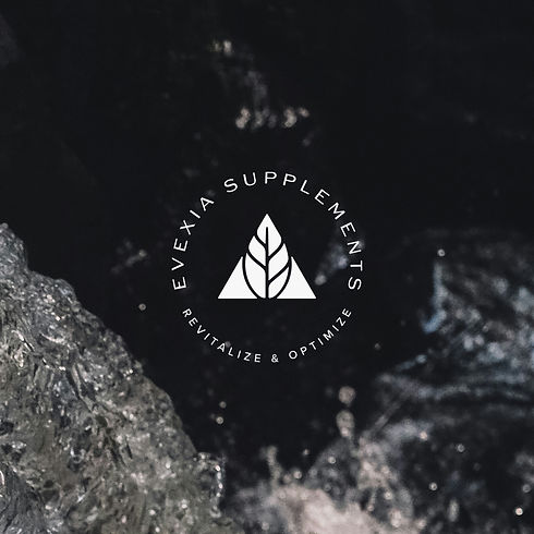
We explored two rounds of logo development before landing on a mark that feels both naturally inspired and sleek. The color palette is organic yet strong, while bold typography pairings add clarity and confidence. For photo direction, the aim was to reflect wellness in a way that speaks to modern men in their 30s who are balancing careers, relationships, and personal growth. Every visual detail reinforces Evexia’s identity as a trusted, aspirational lifestyle brand.
SCOPE OF WORK
'Just the Branding': Full Logo Suite, Color Palette, Fonts, Photo Direction, and Brand Guidelines


